
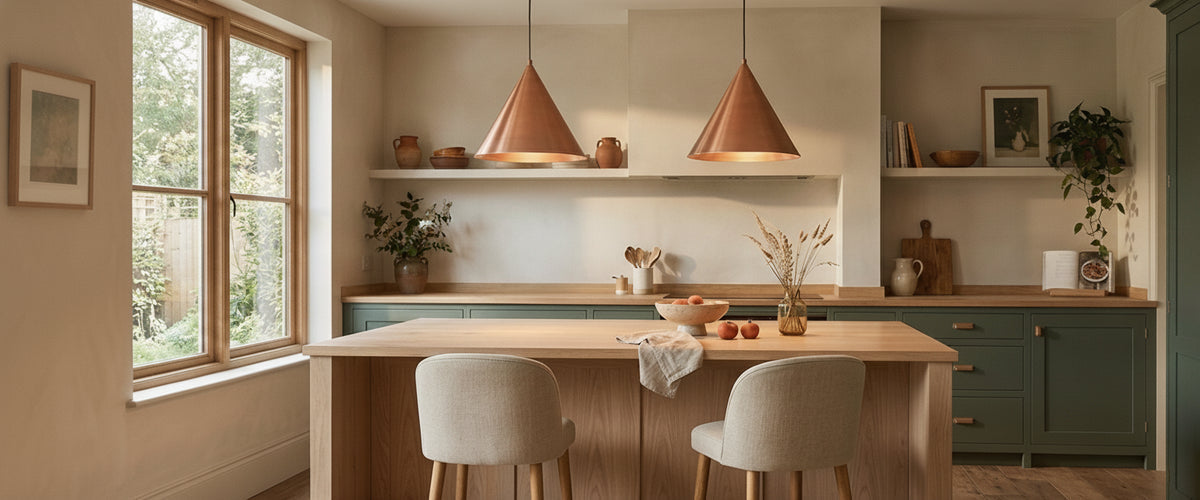

Hang copper pendant lights ten centimetres too high and they look like a sensible kitchen fitting. Drop them to the right height and the whole island picks up a low, ember-coloured warmth that no painted shade can copy. Copper is a reactive, reflective metal, and it responds to its surroundings more than any other finish we see specified. Height, surface treatment, bulb colour and the wall behind it all shift how it reads, often more than the shape of the shade itself.
Key takeaways
- Drop height decides whether copper reads as a glowing object or a flat metallic disc. Aim for roughly 75 to 85 cm (30 to 33 in) above the worktop.
- Lacquered copper stays bright; unlacquered copper darkens and develops character. Choose based on how you feel about year five, not day one.
- A 2700K lamp with a high colour rendering index flatters copper's red undertone. Very warm or cool lamps distort it.
- Three pendants suit long islands with space around them. On shorter runs, one or two larger shades usually look calmer.
- Deep greens, inky blues and warm limewash make copper glow. Orange oak and terracotta tend to swallow it.

Why Drop Height Changes Copper's Character More Than Any Other Variable
Copper is mostly seen by reflection. Hung high, a copper shade shows its underside to the room, and the underside of most shades is either a dark lining or a white reflector. The copper exterior becomes a thin rim of colour at the edge of your vision. Bring it down and the outer curve starts catching light from the lamp below, the worktop and nearby windows. That is when the metal actually looks like copper.
For a copper pendant lights kitchen scheme over an island, start around 75 cm (30 in) from worktop to the bottom of the shade and adjust from there. Taller households often go to 85 cm (33 in) so the shade stays out of the eye line when standing. Over a dining table you can hang a little lower, since everyone is seated. In double-height or vaulted kitchens, resist the urge to hang copper pendant lights at mid-height to fill the void. The fittings float in space, lose their relationship with the surface below and read smaller than they are.
One lesson from the studio: always check the drop with someone standing at the hob or sink, not just from the doorway. A pendant that looks perfect in a photograph can cut straight across the cook's line of sight to guests.

Lacquered or Unlacquered: Year One Versus Year Five
This is the decision buyers of copper pendant lights most often rush, and it matters more than the silhouette.
Lacquered copper is sealed with a clear coat. In year one it is bright, pinkish and highly reflective. By year five it should look much the same, assuming nobody has scrubbed it with abrasive cleaners or kitchen degreaser, which can cloud or lift the lacquer. Once lacquer fails it fails patchily, and the exposed areas darken at a different rate from the sealed ones.
Unlacquered copper starts equally bright but begins oxidising within weeks. It moves through warm brown towards a deep, almost chocolate tone, and in humid spots it can take on the faint green that architectural copper is known for. The Copper Development Association's architectural guidance explains how exposure and environment drive that change. In a kitchen, steam and handling speed it up unevenly.
Picture a pair of raw copper pendants in a family kitchen, one hung directly above the sink. Within a year or two, the sink-side shade will usually be visibly darker and freckled from splashes, while its twin over the prep zone ages more evenly. Some owners love that; many would not. If you want a living finish, embrace the unevenness. If you want both shades to match for years, specify lacquer.
Warm Bulb or Cool Bulb: What Each Does to Copper's Undertone
Copper sits in the red-orange part of the spectrum, so the colour temperature of the lamp inside and around it changes the metal's apparent colour.
- 2200K to 2400K: Candle-warm. Copper turns deep orange, almost pumpkin. Lovely for an evening bar or snug, often too heavy for a working kitchen.
- 2700K: The sweet spot for most homes. Copper keeps its rosy warmth without tipping into orange, and skin tones look natural at the table.
- 3000K: Slightly crisper. Works if your kitchen has a lot of white stone or cool daylight and you want the pendants to sit in with it.
- 4000K and above: Copper looks salmon-brown and a little dull. Avoid this unless the copper pendant lights are purely decorative against brighter task lighting.
Colour rendering matters as much as temperature. Choose lamps rated CRI 90 or above; lower-rendering LEDs flatten reds, and copper suffers first. Check that the lamps are dimmable and compatible with your dimmer, since cheap pairings flicker at low levels, which is exactly when copper looks best.
Single Shade or a Run of Three: When Repetition Flatters and When It Overwhelms
The default run of three copper kitchen pendant lights over an island is popular because it often works. It stops working when the island is short, the ceiling is low or the shades are large.
A useful rule: leave at least 30 cm (12 in) between the edge of the end shade and the end of the island, and roughly 60 to 75 cm (24 to 30 in) between shade centres, adjusted for diameter. If three will not fit with that breathing room, use two, or a single larger shade. A solitary copper dome over a round table can look far more deliberate than three small ones crowding it. On a compact island where three separate drops would feel cramped, a clustered fitting on one canopy, such as the Opaz 3 Light Cluster Pendant Light, Smoked Black, keeps the layered, varied-height effect while needing only one ceiling point.
Repetition flatters when the room is otherwise quiet. In a kitchen with open shelving, patterned tiles and brass taps, three reflective copper shades can tip the space into visual noise. That is where mixing materials helps. Where the island already carries plenty of polished metal, a textured-glass shade with a warm metallic trim, such as the Priscila 1 Light Textured Glass Pendant, Gold, breaks up the reflections rather than adding another mirror-bright surface to the run.
The Backdrops That Let Copper Glow, and the Ones That Cancel It Out
Copper needs contrast in tone, not just colour. The backdrops that work best:
- Deep green or navy cabinetry, where the metal reads as a warm point against a cool field.
- Warm white limewash or polished plaster, which bounces soft light back onto the shade.
- Pale marble or honed stone with grey or warm veining, which picks up copper's reflection subtly.
- Charcoal or blackened timber, for a more dramatic, restaurant-style effect.
The ones that cancel it out are the surfaces already sitting close to copper's own colour: orange-toned oak, terracotta tiles, rose-gold hardware and warm brick. Copper pendant lights against those finishes blend into one amber mass. If you love terracotta floors, lift the copper visually with a paler worktop between them.
Where Alabaster Fits Alongside Copper Kitchen Pendant Lights
At Niori we design alabaster and natural-stone lighting, and copper is one of the metals we find pairs most naturally with it. Copper shades throw light downward in a concentrated pool; alabaster diffuses it sideways through the stone in a soft, even glow. Used together, they solve each other's weaknesses.
A practical approach: let copper pendant lights do the task work over the island, then use alabaster wall lights or a stone pendant over the dining end to fill the room with warmer ambient light. Honey-veined alabaster sits comfortably next to copper, while whiter stone with grey veining gives crisper contrast. If you are planning a mixed scheme, browsing our alabaster lighting collection alongside your metal choices makes it easier to judge how the two tones will sit in the same room.
Specification Mistakes Buyers Only Spot Once the Electrician Has Left
Most regrets about copper pendant lights are not about the shade. They are about everything above it.
- Mismatched ceiling roses. A white plastic ceiling rose above a copper shade breaks the look. Confirm the canopy finish before ordering.
- Flex or suspension too short. Measure ceiling to worktop and add a margin before ordering. Shortening is easy; lengthening often is not.
- Weight on plasterboard alone. Heavier pendants, particularly anything combining metal and stone, need a secure fixing into a joist or noggin.
- No separate dimming circuit. If the pendants share a switch with downlights, you lose the ability to let copper glow on its own in the evening.
- Exposed lamps at seated eye level. Open-bottomed shades hung low can show a bare bulb to anyone sitting at the island. Check from a stool, not standing.
- Extractor clashes. A pendant too close to an island hob sits in a stream of grease and heat, which ruins lacquer quickly.
Any new lighting circuit or change to kitchen wiring should be carried out by a qualified electrician working to BS 7671, the IET Wiring Regulations. In England and Wales, some kitchen electrical work is also notifiable under building regulations, so ask your electrician to confirm what certification you will receive.
Buyer's Checklist for Copper Pendant Lights
- Measure island or table length and plan spacing before deciding on quantity.
- Decide lacquered or unlacquered with a clear view of how you want it to look in five years.
- Specify 2700K, CRI 90+, dimmable lamps and confirm dimmer compatibility.
- Check ceiling construction and fixing points for the fitting's weight.
- Confirm canopy, flex and suspension finishes match the shade.
- Test the drop height from standing and seated positions before final fixing.
- Clean lacquered copper with a soft, dry or barely damp cloth only; no abrasives or sprays.
Budget depends on material, scale, finishing and installation complexity, particularly when copper is combined with hand-carved stone. For project work or anything bespoke, request a tailored quote. If you are still weighing up the room as a whole, our full lighting range shows how pendants, wall lights and lamps can be combined around a copper centrepiece.