
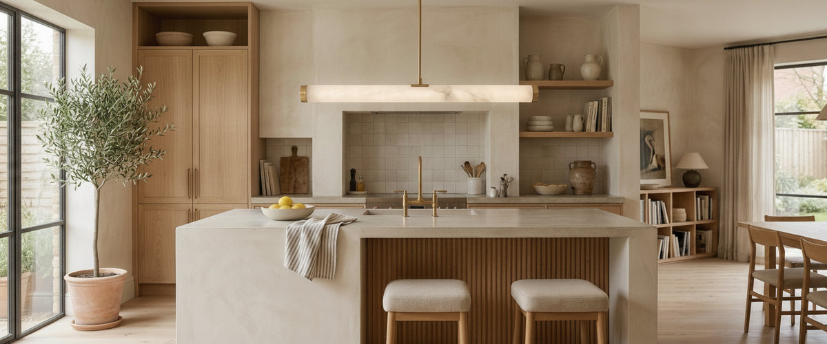

Copper photographs beautifully and misbehaves quietly. Hang a copper bar pendant light over the wrong worktop, at the wrong height, against the wrong splashback, and that warm metallic sheen flattens into a brown smear with three hot spots punched through it. Get a copper bar pendant light right and the same fixture does two jobs at once: honest task light on the surface below, and a low, flattering wash across the faces of everyone leaning on the island. The difference is rarely the fixture. It is almost always proportion, backdrop and beam control.

Key Takeaways Before You Buy
Bar length should read as roughly half to two thirds of the island length, with clear breathing space at both ends.
Copper is a living finish. It warms and darkens over years, which slowly shifts the color of the light it bounces.
Height matters more than style. Around 30 to 35in (75 to 90cm) above a worktop suits most kitchens; hang a copper bar pendant light lower over a dining table than over a walkway.
Bare copper next to bare bulbs is a glare problem. Alabaster, opal glass or a deep-set baffle solves it.
Backdrop decides everything. Copper sings against pale plaster, warm stone and deep green. It dies against orange-toned timber.
Dim on a trailing-edge dimmer with warm-dim or 2700K lamps so the metal never turns sour at low output.

Why Bar Pendants Behave Differently Above Islands Versus Dining Tables
A dining table is a destination. People sit, the light pools, and the fixture can hang low because nobody walks through it. An island is a junction. People pass it, work at it, lean on it and reach across it, and a copper bar pendant light has to survive all four of those uses without blinding anyone.
That changes what you ask of a copper bar pendant light. Over a table you can accept a soft, largely decorative glow, because the bar is doing atmosphere work and the room's other layers handle the rest. Over an island you need measurable light on the surface for chopping, reading a recipe and pouring drinks, and you need it without a mirror image of the lamp burning back at you from a polished quartz worktop.
Two practical consequences. First, hang higher over an island than you would over a table, and keep the underside clear of sightlines across the room. Second, prefer a diffused source. Polished copper is a specular reflector, so a naked filament under a raw copper canopy will throw sharp, restless highlights across a glossy worktop. A translucent shade tames that instantly, which is why so much of the Niori range pairs warm metalwork with stone diffusers.
Copper Is a Live Finish, and It Shifts the Light Over Time
The finish on a copper bar pendant light does not stay the color it was on delivery day. Handling, humidity and cooking vapours all work on unlacquered copper, and the metal moves from bright salmon-pink through amber and russet toward a deep, quiet brown. The Copper Development Association publishes the chemistry behind that progression if you want the detail.
The lighting consequence is subtle and real. A bright copper reflector adds warmth to the light it bounces, pushing the perceived color temperature down. As the patina deepens, the metal absorbs more than it reflects, so downward output from the copper bar pendant light drops slightly and the bounced light becomes browner and less lively. Buyers who chose a cool 4000K lamp to "balance" new copper often find that a few years later the room reads flat and gray-brown.
Two ways to handle it. Choose a lacquered or living-finish copper bar pendant light and know which you have bought, because lacquered copper holds its color and needs different cleaning. Or accept the patina and specify lamps at 2700K with high color rendering, so the fixture's own warmth is the variable rather than the light source. If you want the copper tone without the drift, a brushed brass detail against an alabaster shade holds far steadier; something like the Elvaris LED Alabaster Pendant Light in Brushed Brass keeps the same warm metallic register year after year, which is a sensible substitution in a kitchen already carrying several changeable finishes.
The Proportion Rule Most Buyers Ignore Until the Island Is In
Here is the mistake we see most often in project drawings. Someone specifies bar pendant lights in copper based on how the piece looks in a photograph, then discovers the bar is either stranded in the middle of a 10ft (3m) island like a hyphen, or running so close to the edges that it reads like a shelf.
Work to a ratio instead of a hunch:
Island 6 to 7ft (1.8 to 2.2m): a single bar around 3 to 4ft (90cm to 1.2m) usually sits well.
Island 8 to 10ft (2.4 to 3m): a longer linear bar, or two shorter pendants spaced evenly, with the fixture centered on the worktop rather than on the ceiling joists.
Leave at least 8 to 10in (20 to 25cm) of clear worktop beyond each end of the fixture so the bar does not appear to overhang.
Peninsula or breakfast bar under 5ft (1.5m): a single pendant almost always beats a bar. A short copper bar pendant light in a narrow space looks apologetic.
One more thing that catches people out: ceiling height. Below about 8ft (2.4m), a substantial bar starts to feel like a low beam. In those rooms a slimmer profile with a stone or opal diffuser gives you the same light with less visual bulk, and a compact stone shade such as the Serava LED Small Alabaster Pendant holds the drop without crowding the head height. We have talked more than one client out of a chunky copper bar pendant light and into a slim alabaster linear pendant once a section drawing showed the ceiling sitting under 8ft (2.4m). Usually the right call, and it saves a return.
Single Bar or Linear Multi-Pendant: Which Configuration Owns the Space
A single continuous copper bar pendant light is the quieter, more architectural choice. It reads as one line, it suits contemporary kitchens with minimal joinery lines, and it keeps the ceiling calm. It is also more forgiving of an off-centre island, because one object is easier to visually re-centre than three.
A run of individual copper pendant bar lights on a shared canopy has more rhythm. It suits longer islands, taller rooms and kitchens where the joinery already has repeating detail such as glazing bars or fluting. If you want that repeated rhythm without adding another warm metal to the room, a three-head frame like the Vesper 3 Light Bar Pendant in White shows how the format behaves when the structure recedes and the shades do the work. The risk is spacing. Pendants set too close look like they are queuing; too far apart and the island loses its centre of gravity. As a starting point, treat the gap between pendant centres as roughly one and a half times the shade diameter, then adjust by eye at installation with the electrician on site.
There is a hybrid worth considering. A copper or brass linear frame carrying alabaster shades gives you the metal's warmth in the structure and the stone's diffusion in the light, and it is where a copper bar pendant light earns its keep in a busy kitchen. You can see how that combination behaves across the alabaster lighting collection, where the stone does the softening and the metalwork carries the color story.
Backdrops That Sharpen Copper, and the Ones That Make It Look Muddy
Copper needs contrast. Put a copper bar pendant light in front of something with a similar warmth and value and it disappears into the wall.
Backdrops that work: chalky off-white plaster, pale limestone and honed marble, deep forest or olive green, charcoal and near-black cabinetry, cool gray concrete, and blue-toned tiles. Anything that reads cooler or paler than the metal will push the copper forward.
Backdrops that fight it: orange-toned oak and cherry, terracotta tiles, warm beige paint, brushed gold hardware in the same warm family, and heavily veined brown stone. If your kitchen already leans amber, a copper bar pendant light can look like a smudge rather than a feature.
A useful trick when the room is unavoidably warm: introduce a pale stone shade under the copper bar pendant light. Backlit alabaster reads as a clean, creamy white with faint honey veining, and that pale plane gives the eye somewhere to rest while the metal supplies the accent. Alabaster is a gypsum stone, far softer and more translucent than the limestones and marbles it usually sits beside, which is exactly the property that makes it such an effective diffuser. Historic England's technical advice on building materials covers how the stone behaves in practice.
Bulbs, Beam Control and Dimming Beneath a Bar
Task work and mood lighting pull in opposite directions, and a copper bar pendant light has to serve both. The way to reconcile them is directionality plus dimming, not raw wattage.
Color temperature: 2700K is the safe choice with copper. 3000K works if the room is otherwise cool and the shades are stone or opal. Avoid 4000K unless the fixture is purely functional.
Color rendering: specify CRI 90 or above. Food, timber and skin all look wrong under poor rendering, and copper's own hue is badly served by cheap LEDs.
Beam behaviour: a narrow downward beam is right for prep work; a diffused source is right for eating and talking. A bar that mixes a shallow downlight component with a translucent shade gives you both.
Layering: never expect a copper bar pendant light to cover the whole worktop. Under-cabinet strips or discreet downlights at the perimeter carry the working light so the pendant can stay at a comfortable level.
Dimming: use a trailing-edge dimmer rated for LED loads and check compatibility with the driver before you order. Warm-dim lamps that shift toward 2200K at low output flatter copper enormously in the evening.
Wiring: all mains work should be carried out by a qualified electrician, particularly where you are adding a new ceiling outlet over an island.
A Quick Checklist Before You Order
Measure the island, not the room, and apply the half to two thirds length ratio.
Confirm ceiling height and mounting point, then check the drop range the fixture allows.
Decide lacquered or living-finish copper for your copper bar pendant light, and tell your installer which it is.
Hold a copper sample against the splashback and cabinet color in daylight and at night.
Check the fixture weight and whether the ceiling needs a spreader or noggin.
Confirm lamp type, color temperature and dimmer compatibility as one decision, not three.
Plan the secondary layer: under-cabinet, perimeter or wall lights.
Ask about lead time and finishing options before you commit joinery dates.
Living With Copper and Stone Over the Long Term
Copper wants a dry, soft cloth and nothing else in normal use. Skip abrasive creams and acidic polishes unless you deliberately want to strip the patina back, and keep polishes away from any adjacent stone shade entirely. Fingerprints on unlacquered copper will develop into permanent marks, which some owners love and others hate; decide which camp you are in before you specify a copper bar pendant light that gets touched.
Alabaster and marble shades need the opposite discipline. Dust dry with a lint-free cloth, never soak them, and keep household sprays well away, because gypsum alabaster is soft and reacts badly to water and acids. In a kitchen, a light dust every few weeks stops cooking film building into something harder to remove later.
If you are still weighing configurations, it helps to look across fixture types rather than fixating on one silhouette. Wall lights flanking a range, a pair of table lamps on a sideboard and a copper bar pendant light over the island are one scheme, not three purchases, and the full lighting range is worth scanning with that whole-room view in mind. Settle the size and configuration first, then price it: material, scale, finishing and installation all move the number, and working backwards from a budget tends to produce the wrong fixture.
Copper rewards commitment. Choose the proportion carefully, give it a backdrop with some contrast, control the glare with stone or opal, and the copper bar pendant light will look better in ten years than it did on the day it went up.