

Black and gold is one of the easiest palettes to buy and one of the hardest to place. On a white studio background, a black gold chandelier looks decisive and expensive. Hang that same black gold chandelier in a room with cool gray walls, a low ceiling and a 4000K lamp in the socket, and the black turns into a heavy silhouette while the gold reads brassy and cheap. The fixture did not change. The room around it did all the damage.
Key takeaways
Polished gold and warm brass behave differently at ceiling height. A black gold chandelier in plated gold holds a sharper highlight; brass softens into the shadow.
Warm wall tones (chalky white, putty, clay, deep green) let black and gold breathe. Cool blue-grays and stark builder white flatten the contrast.
Ceiling height sets the ceiling on scale. Under roughly 2.4m (8ft), go linear or compact rather than tall and tiered.
2700K is the working default. It warms the gold and stops matt black from turning blue-gray.
Alabaster or natural-stone diffusers give a black gold chandelier something to glow from, so the frame reads as structure rather than a heavy cage.

Black and Gold Is Not the Same as Black and Brass
Buyers use the two phrases interchangeably. Ceilings do not. Polished or plated gold has a tighter, more mirror-like reflection, so every arm and collar catches a distinct highlight. That gives a black gold chandelier a graphic, high-contrast quality, closer to jewelry than joinery. Warm unlacquered or brushed brass scatters light more gently, which lets the metal blend into the black frame and read as one continuous form.
The practical consequence sits about three meters above your head. Gold at height keeps its sparkle, so a black gold chandelier looks intentional in rooms with a formal edge: paneled dining rooms, hotel lobbies, stairwell voids with a long sightline. Brass at height goes quieter and warmer, which suits kitchens, snugs and family spaces where you do not want the fitting to dominate conversation. Neither is better. But if you specify gold and then choose brass ironmongery elsewhere, the mismatch shows up in photographs long before anyone notices it in person.
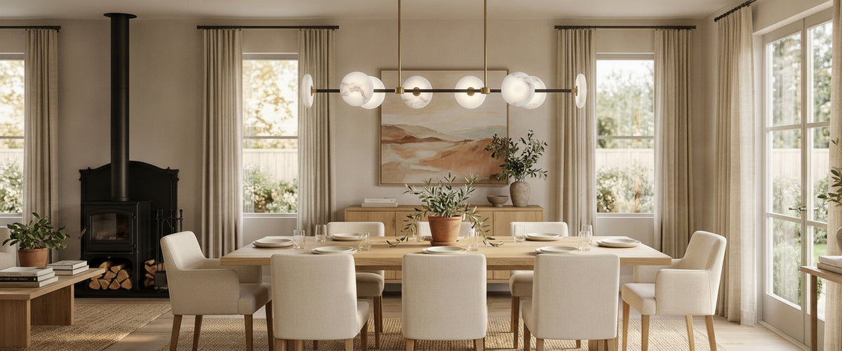
A dark frame with brass detailing and alabaster diffusers: the stone carries the light, so the armature reads as structure rather than mass.
There is a third route that we see designers reach for more often now: a matt black frame with brass detailing and alabaster diffusers. This is black gold chandelier logic taken one step further. The stone carries the light, the brass warms the joints, and the black does structural work only. Where a room needs a soft, diffused glow rather than glittering highlights, a layered form such as the Aurelian LED Layered Arms Alabaster Chandelier in Matt Black is closer to the right design language, because the stone discs glow and the black armature almost disappears once the dimmer drops. Over a long rectangular table where a round fixture fights the geometry, the Aurevia 14 Light LED Linear Alabaster Chandelier in Matt Black & Brass handles the same palette in a shape that follows the tabletop. If you want to compare that softer approach against a purely metal fixture, the alabaster lighting collection is the fastest way to see how much a translucent diffuser changes the mood of a dark frame.

The Wall Tones and Flooring That Let the Contrast Breathe
A black gold chandelier needs a warm, slightly imperfect background. Chalky off-whites, putty, clay, mushroom, tobacco, deep bottle green and oxblood all work, because they hold enough pigment to keep the black from looking like a hole punched in the wall. Deep colors are not the risk people assume. A dark frame with gold highlights set against green paneling reads as a glowing object, especially once alabaster or opal glass is doing the diffusion.
The tones that kill it are cool. Blue-gray, lilac-gray and hard bright white push the black toward navy and drag the gold toward yellow. Silver-toned porcelain floors and cool LED downlights make it worse, because everything else in the room is fighting the fixture's color temperature. If you already live with cool gray walls and cannot repaint, choose a black gold chandelier where the black is matt rather than gloss, keep the gold restrained to small details, and warm the room with textiles rather than hoping the fixture will fix it.
Flooring matters more than most buyers expect. Mid to dark oak, walnut, warm limestone and terracotta give the black something to relate to at the other end of the room. A black gold chandelier floating above pale gray floors and pale gray walls has no anchor, so it looks stranded. One rule that has never failed us: black should appear at least twice in a room, even if the second appearance is only window frames, a fireplace surround or the legs of a dining table.
Ceiling Height, Room Width and the Point Where Bold Turns Oppressive
Dark fixtures read visually heavier than pale ones at the same physical size. That is the whole scale problem in one sentence. A cream alabaster chandelier can be generous and still feel light; the same volume in a black gold chandelier presses down on the room.
Height buys permission to go sculptural: in a void, an open branching frame reads as a drawing in space rather than a mass.
Under 2.4m (8ft): keep a black gold chandelier to linear bars, flush or semi-flush forms, or a compact single tier. Tall tiered shapes eat headroom and shadow faces at a dining table.
2.4m to 3m (8ft to 10ft): the sweet spot for most homes. Over a dining table, aim for the lowest point of the fixture to sit roughly 75cm to 90cm (30in to 36in) above the tabletop.
Over 3m (10ft) or a stairwell void: height gives you permission to go sculptural. Cascading and multi-tier designs earn their keep here, and a black gold chandelier with an open branching frame such as the Galaxy 12 Light Branching Chandelier in Black & Brass becomes a drawing in space rather than a mass, because the void carries the spread without the frame closing in.
Width discipline is simpler. Over a table, keep the black gold chandelier narrower than the table so nobody knocks a shoulder standing up; roughly half to two-thirds of the table width is a safe band. In an open-plan room, judge the fixture against the visual zone it lights, not against the total floor area. A designer we worked with on a Cheshire barn conversion nearly ordered a fixture sized for the whole 9m room, when the piece only ever needed to serve the dining end. The smaller option looked far more confident once it was up.
Which Rooms Actually Earn a Black Gold Chandelier
Dining rooms earn one most easily. The fixture sits over a defined surface, sightlines are controlled, and the contrast has a job: framing the table. Entrance halls and stairwell voids come a close second, because the drop is read from below and from the landing, so a dark frame with gold highlights gives you a proper silhouette from two viewpoints. Formal sitting rooms with paneling or a strong fireplace can carry one, provided the black repeats elsewhere.
Rooms that merely want one? Small bedrooms, low-ceilinged bathrooms and busy kitchens with a lot of competing hardware. In a bedroom you want the light source out of the eyeline when you are lying down, and a heavy dark frame overhead rarely helps sleep-time calm; a pair of alabaster wall lights and a stone table lamp will do more for the room. In a kitchen, a black gold chandelier over an island competes with the tap, handles, appliances and extractor. If the room already has five metal finishes, adding a sixth is a losing move. Browsing the wider lighting range by fixture type rather than by color usually solves this faster, because the honest answer is sometimes a linear pendant rather than a chandelier.
Bulb Temperature and Dimming Behaviour
Color temperature is the cheapest way to rescue or ruin this palette. At 2700K the gold on a black gold chandelier looks like gold: warm, slightly amber, alive. Push to 3000K and it goes cleaner but starts to lose depth. At 4000K the gold looks like raw metal and matt black shifts toward blue-gray. For domestic dining and living spaces, 2700K is the default we recommend, and the Society of Light and Lighting's guidance on warmer sources in residential settings backs that instinct up (CIBSE SLL).
Color rendering matters too. Aim for CRI 90 or better, especially where alabaster or onyx is involved. Cheap lamps with poor rendering strip the warmth out of stone veining and make gold look flat. On dimming, check three things before you buy: whether the driver is dim-to-warm, whether the dimmer module is compatible with the fixture's LED driver, and whether all lamps in the same room dim on the same curve. Mixed drivers on one circuit produce the mismatch where one arm glows amber while another stays cold. Any hard-wiring, dimmer replacement or ceiling-rose work should go to a qualified electrician; the safety case for that is well set out by Electrical Safety First.
One studio observation worth repeating: a black gold chandelier looks its best at around 30 to 50 percent output. Full brightness exaggerates the contrast and flattens the stone. If the fixture has no dimming, you have removed its best setting.
The Surrounding Metalwork That Unifies the Palette
Two metal families in a room is comfortable. Four is chaos. Decide which finish leads and let the rest support it. If the gold on your black gold chandelier leads, echo it in one or two places: a mirror frame, drawer pulls, the base of a stone table lamp. Keep sockets, switches and curtain poles quieter in black, bronze or plain white.
Do not try to match gold tones exactly across suppliers. Plating varies, and near-misses look worse than deliberate difference. A better tactic is to separate the golds by distance or by material, so the eye never compares them side by side. Alabaster and marble help enormously here, because the stone acts as a neutral buffer between metal finishes.
Buyer's Checklist Before You Commit
Confirm your ceiling height and the intended drop of the black gold chandelier, then check the lowest point against the table or floor clearance you need.
Test your wall color under a 2700K lamp at night, not in daylight.
Count the metal finishes already in the room and decide which one leads.
Check that black appears at least twice elsewhere in the space.
Specify CRI 90+ lamps and confirm dimmer and driver compatibility.
Ask about fixing weight and ceiling structure; heavier multi-arm and stone fixtures may need a joist or a suitable brace.
For stone elements, plan care in advance: dry dusting with a soft cloth, no acidic or abrasive cleaners, and no solvents near alabaster.
Budget realistically. Cost tracks material, scale, arm count, engineering, installation and finishing, so ask for a tailored quote rather than working from a headline figure.
Where Alabaster Changes the Equation
The reason we keep steering buyers toward stone diffusers is simple. A black gold chandelier with clear glass or bare lamps gives you contrast and glare in the same package. Swap in alabaster and the light becomes soft and diffused, the veining picks up a warm amber cast, and the dark frame stops competing with the light source. Gypsum alabaster is a soft, translucent stone, which is exactly why it glows and exactly why it needs sensible care over decades.
That combination, a dark structural frame with brass warmth and glowing stone, is the version of the black gold chandelier we see specified most often for dining rooms, hotel bars and restaurant private rooms. It reads bold from across the room and gentle at the table.