Introduction
Linear lighting can make a home feel sharper, calmer, and more considered when it’s chosen with the room in mind. It’s especially effective where you want a clean, architectural line that gently guides the eye through a space. When the scale is right, it can make kitchens, dining areas, and hallways feel more balanced and thoughtfully finished. The key is treating linear lighting as part of the room’s structure, not just an added accessory.
The same fixture can look harsh or out of place if the proportions are wrong or the light quality isn’t comfortable. As a Niori lighting specialist, I see the same issues again and again: the fitting is the wrong length, the glare is underestimated, or it’s expected to do the job of several layers of light. That’s why it pays to plan for size, placement, diffusion, and dimming from the start. This guide covers the practical do’s and don’ts of linear lighting that help you get the look you want without losing comfort.

What Is Linear Lighting, And Why Does It Change How A Room Feels?
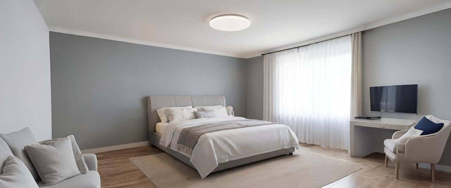
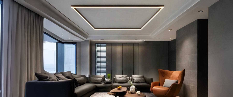
Linear lighting is a long, continuous light source that creates an even wash of light across a surface or pathway. Unlike a single pendant that reads as a “point” of light, a line reads as architecture. That’s why it can make a kitchen look professionally finished or make a room feel visually crowded if it’s oversized.
In most homes, you’ll see it used:
Over kitchen island lighting and peninsulas
Above dining tables
In hallways and utility spaces
In open-plan zones where you want clean structure
Because it’s such a strong visual element, it needs planning that goes beyond “Does it look nice?” Getting the size, placement, and light quality right is what makes it feel intentional, comfortable, and well-balanced in the room.

What Should You Decide Before You Buy Anything?
You should decide what job the light needs to do before you pick a style. This prevents the most common mistake: choosing a beautiful fixture that doesn’t suit the way you use the space.
Start with your key decisions:
Purpose: task lighting, ambient lighting, or both
Control: on/off only, or dimming for flexibility
Viewpoints: where you’ll sit, stand, and enter the room (to prevent glare)
Finish: match the colour and texture to nearby hardware and fittings so the result feels cohesive
Installation limits: check ceiling height, wiring position, and whether linear lighting should be surface-mounted or suspended for the space
If you get these right early, the rest of the choices become much easier and you avoid expensive changes later.

What Are The Top Do’s And Don’ts For Linear Lighting?
The best results come from balancing scale, comfort, and the rest of the lighting in the room. Treat linear lighting as a key part of your scheme, not a last-minute add-on.
Do: Choose the right size for the surface, not the ceiling
A well-sized fixture looks intentional and keeps the room in proportion. Most people choose by guesswork, then wonder why it feels “off” once installed.
A reliable sizing approach:
Aim for 60-75% of the length of the table or island
Leave equal visual breathing space at both ends
Consider room width too very long fittings can feel heavy in narrow spaces
Real example: If your island is 200cm long, a 120-150cm fixture usually looks balanced and practical.
Don’t: Pick a length that visually dominates the room
Over-sizing is the quickest way to make a space feel cramped. Even in open-plan layouts, an overlong line can compete with cabinetry, windows, and furniture edges.
Warning signs you’ve gone too long:
The fixture nearly reaches the ends of the island/table
It feels like it “cuts” the room in half
It draws attention away from the features you actually want to highlight
Do: Use this step-by-step check before you commit
A simple mock-up prevents most proportion mistakes. Do this before you buy, especially if you’re ordering online.
Step-by-step sizing and placement check
Measure the length of the surface you’re lighting.
Mark your ideal fixture length on the ceiling with masking tape.
Stand at key viewpoints (doorway, sofa, dining chairs, stools).
Check headroom and sightlines make sure it won’t glare when seated.
Confirm the drop height suits the ceiling and the purpose of the space.
This takes ten minutes and saves weeks of frustration.

How Do You Avoid Glare And Harsh Light In Everyday Use?
You avoid glare by choosing good diffusion and planning for sightlines at seated height when using linear lighting. This matters most over islands and dining tables, where people spend time looking across the room rather than up at the ceiling.
Key comfort choices that make a big difference:
Choose a fixture with a diffuser or recessed light source
Avoid exposed LEDs where the light is visible from stools or chairs
Add dimming so you can soften the room after dark
Pick the right colour temperature for the room (warmer for dining and living, slightly more neutral for kitchens)
Check the beam spread and output so the surface is evenly lit without “hot spots”
Use a matte or satin finish where possible to reduce distracting reflections on the fitting itself
Position the fixture so the light source isn’t visible from the main seated viewpoints (sofa, dining chairs, bar stools)
If you like the clean look of linear lighting but worry about it feeling too bright, prioritise a diffused lens and warm colour temperature from the start.

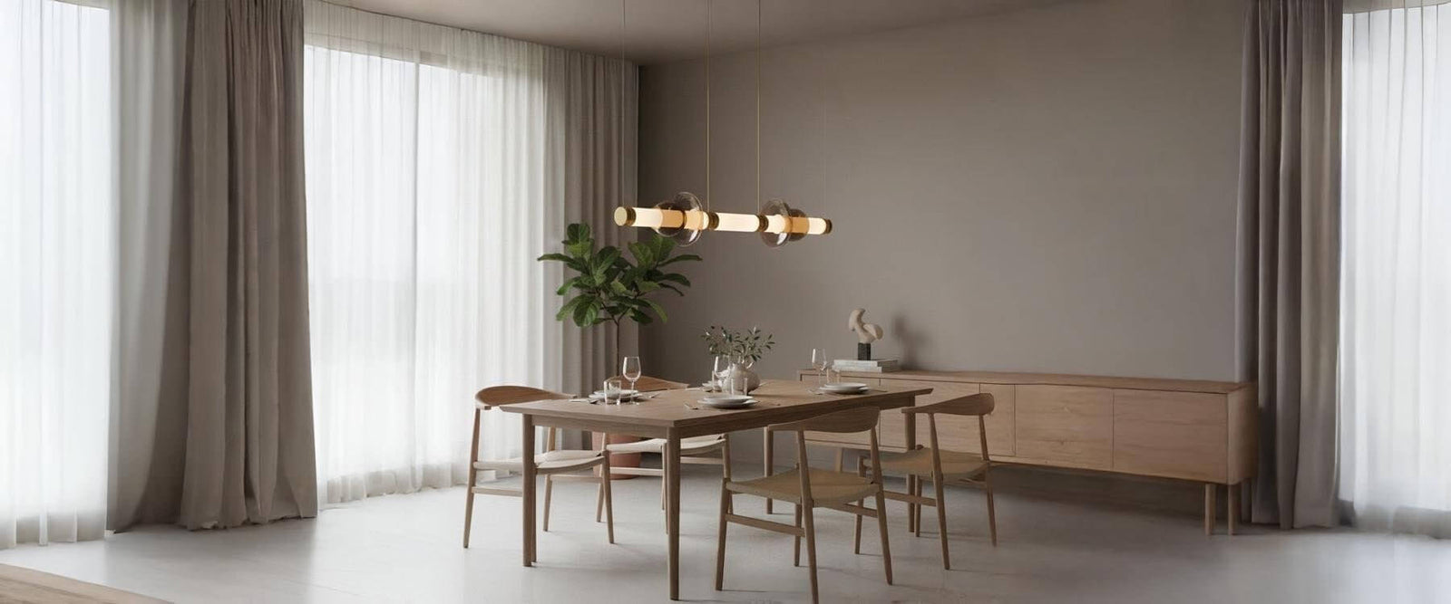
How Do You Pair It With Other Fixtures Without Making The Room Messy?
You pair it best by using linear lighting as one layer, supported by other lights for depth and flexibility. A single line can be excellent for task lighting, but it rarely creates the warmth people want in the evening.
A balanced approach often looks like this:
Downlights or directional spots for corners and circulation routes
Wall lights to add softness and reduce shadowing
Table and floor lamps for atmosphere in living zones
Under-cabinet lighting to brighten worktops without adding glare at eye level
Accent lighting (such as picture lights or shelf lighting) to highlight textures and create depth, so linear lighting doesn’t have to do all the visual work
If you want a statement piece elsewhere, that’s the moment to bring in something decorative many homeowners keep the island simple and use modern chandeliers over a dining table to add personality without cluttering the kitchen.

What Style Clashes Should You Avoid?
You should avoid mixing a highly technical-looking fixture with an interior that leans traditional or ornate. Strong lines are beautiful, but they need to relate to the finishes and shapes already in the room.
Clashes I’d steer you away from:
Cool, bluish light in warm timber or earthy palettes
Very glossy chrome in rustic or heritage spaces
An ultra-minimal bar in a room full of curves and decorative trims
Oversized fittings in low-ceiling rooms, where the line feels heavy and visually compresses the space
Mixed metal finishes that fight each other (for example, a cool brushed steel fixture alongside warm brass hardware), which can make linear lighting look accidental rather than integrated
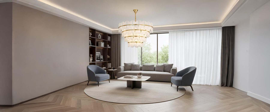
If your home suits sparkle or classic glamour, save that feeling for a different zone crystal chandeliers can look stunning in an entry or dining space while your practical lighting stays clean and calm.
.
Where Should You Place It In Kitchens, Dining Rooms, And Hallways?
The fixture should align with the feature it serves, not the centre of the room. Centring to the room often creates awkward relationships with islands, tables, or walkways.
Placement guidance that works in most homes:
Over an island: centre it to the work surface, and keep it aligned with the long axis
Over a dining table: centre it to the table, not the ceiling rose location if the furniture is offset
In a hallway: keep headroom generous and consider a flush or semi-flush profile
Over a kitchen sink or main prep zone: position it so it lights the working area evenly without casting your shadow as you stand at the counter
In open-plan spaces: line it up with the main “zones” (island, dining, seating) so the ceiling layout feels ordered rather than random, especially when using linear lighting
Height matters too. Over islands, many homes land around 75-90cm above the worktop, adjusted for ceiling height and brightness. Over dining, slightly lower can feel more intimate as long as you can still see across the table comfortably.

What Quality Details Are Worth Paying For?
Better build quality shows more clearly on long fixtures than on almost any other fitting, especially with linear lighting. Because the line is uninterrupted, you notice poor diffusion, uneven colour, or sagging installation immediately.
Look for:
Even diffusion with no hotspots
Consistent colour along the whole length
A driver that suits your dimmer (for smooth control)
Solid fixings that keep everything straight and secure
High colour rendering (CRI) so finishes, food, and skin tones look natural
Easy-clean materials and a sealed design, especially in kitchens where grease and dust build up
With linear lighting, these details are what keep the finish looking crisp and the light feeling comfortable over time. For clients building a premium, coordinated scheme, we sometimes match the practical line with a refined statement elsewhere; Fredrick Ramond is one brand people consider when they want that tailored, architectural feel.

Quick Summary
Size the fixture to the surface and leave space at both ends.
Choose diffused light and warm tones for comfort.
Check glare from seated viewpoints before setting height.
Build layers with downlights, wall lights, and lamps.
Keep style consistent so the room feels cohesive.

Conclusion
Linear lighting works best when you treat it as part of the room’s structure, not just a finishing touch. Get the length right for the surface, plan the drop height around sightlines, and choose a diffused light source so the space feels comfortable rather than harsh. Support it with other fixtures to create depth, flexibility, and warmth across the day. When the size, placement, style, and light quality are aligned, linear lighting becomes one of the cleanest ways to make a home feel polished and easy to live in.