

Brushed chrome light switches are among the smallest metal objects on your wall and among the most stared at. Your hand finds one a dozen times a day, your eye clocks it every time you walk in, and its finish shifts depending on the light around it. Get the placement right and the plate disappears into a considered scheme. Get it wrong and it sits there like a coin dropped on a clean surface. This guide is about the second half of that equation: not the wiring, but where brushed chrome light switches land, how high they sit, and how their cool grey face behaves against different walls and different lighting.
We fit a lot of alabaster and stone lighting into rooms that already have their metalwork chosen, so we spend more time than most thinking about how brushed chrome light switches read next to a warm, diffused glow. The two have to agree with each other.
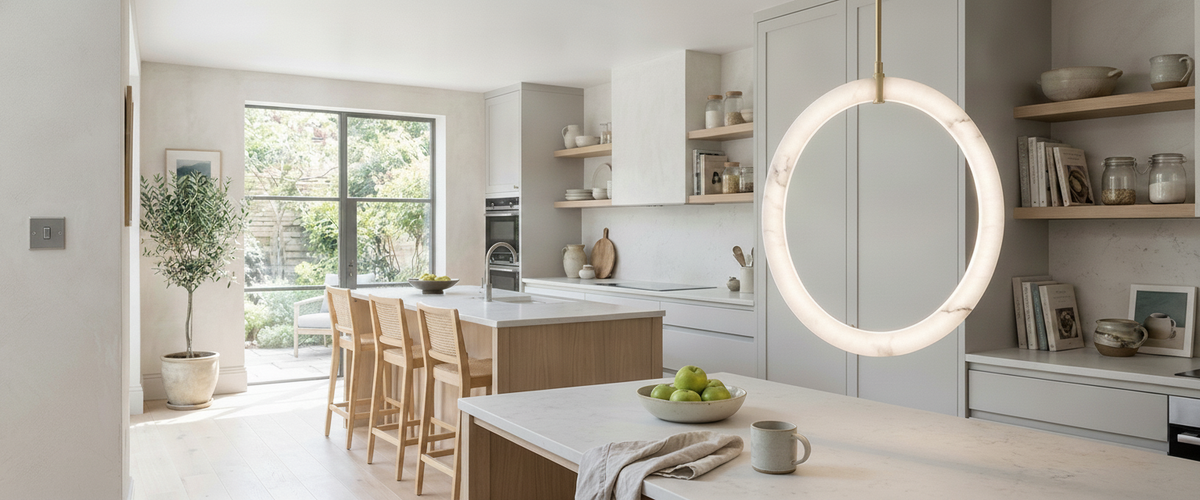
Brushed chrome sits calmly against cool kitchen surfaces.

Key Takeaways
Brushed chrome reads cooler and flatter than polished chrome, which suits both bright and dim rooms without glaring.
Mounting height and sightline matter more than the switch itself; align runs to a consistent centre line.
Cool metal earns its place in bathrooms and kitchens, and works in bedrooms if you warm the light around it.
Match plate style and orientation across an open-plan space so nothing jars.
The wall behind the switch changes how it reads: dark plaster hides it, pale render frames it.

The Same Switch Reads Differently in a Bright Kitchen and a Dim Hallway
Brushed chrome has a soft directional grain that scatters light rather than bouncing it back at you. In a bright kitchen with daylight and downlights, that matters. A polished finish in the same spot throws hard reflections and shows every fingerprint; brushed chrome light switches stay calm and even, holding their grey tone through the day. They look intentional next to stainless appliances and stone worktops rather than competing with them.
Drop the same plate into a dim hallway lit by a single alabaster wall light and it behaves like a different object. With less light to catch, the metal recedes into a quiet pewter grey. That is usually what you want in a circulation space, where the fitting itself, not the switch, should carry the eye. If you are building a scheme around warm, low-level light, the plate should be the thing you feel for, not the thing you look at. You can see how that soft glow behaves across our alabaster lighting range.
Mounting Height and Sightlines: the Switch You See Every Time You Enter
Most jarring switch placements are not about finish at all. They are about height. A switch set slightly too high or too low sits at the wrong point in your eyeline the moment you cross the threshold, and no finish rescues it.
Common practice for new work puts switches around 1.2 metres to the centre, in line with accessibility guidance so the same reach works for most people; the government's Approved Document M sets out the reasoning behind consistent switch and socket heights (see the Approved Document M guidance). The number matters less than the discipline: pick a centre line and hold it through the whole property. Nothing reads worse than three plates at three heights on one landing, so keep your brushed chrome light switches to that single line.
Think about the approach, too. You want the switch on the handle side of the door, where your hand naturally lands as you walk in, not stranded behind the door swing where you reach around for it in the dark. For a single entry point onto a two-way circuit, a plate like the 10AX 6G 2-way switch in brushed chrome keeps the gang count sensible while still handling several lighting lines from one position.
Holding one centre line keeps a run reading evenly.
Bathrooms, Kitchens, Bedrooms: Where Cool Metal Earns Its Place
Brushed chrome light switches sit most comfortably in rooms with hard, cool surfaces. In a bathroom the finish echoes the taps, the shower fittings and the mirror frame, and its matte grain hides water spots far better than a polished plate. Switches inside a bathroom are governed by zone rules, so most switching lives outside the door or uses a pull cord. Plan the plate positions on the dry wall where they belong and leave the wet zones to a qualified electrician.
Kitchens are the natural home for it. Against grey stone, pale marble or stainless steel, brushed chrome light switches look like part of the same family. We often specify them alongside a single alabaster pendant over an island, where the warm stone glow above and the cool metal plate below balance each other rather than clash. Where the worktop takes daily use, a steel-fronted plate such as the stainless steel 13A double socket with metal rockers in brushed chrome matches the appliances more closely than a moulded plate, and the metal rockers wear better than plastic ones near the hob.
Bedrooms are the room people get wrong. Cool metal can feel clinical next to soft textiles and low light. It still works, but only if the lighting around it leans warm. Pair the finish with a warm-white bedside lamp in alabaster or onyx and the switch reads as a crisp detail rather than a cold one. Browse the wider lighting collection to see how warm stone fittings soften a cool metal scheme.
Matching Switch Runs Across an Open-Plan Space
Open-plan rooms punish inconsistency. When the kitchen, dining and living zones share sightlines, every switch plate is on show at once, so your brushed chrome light switches need to belong to one set.
Three things keep a run coherent:
One finish, one plate style. Do not mix brushed chrome with polished chrome or brass across a single continuous space unless you are doing it deliberately and consistently.
Consistent gang orientation. If your double switches run vertically in one corner and horizontally in another, the eye catches it. Keep rockers aligned.
Aligned heights and edges. Where a switch plate sits near a socket, line up their top or centre lines so the wall looks set out rather than scattered.
The same logic applies to sockets. A brushed chrome double socket with a matching insert, whether black or white, should carry the same tone as the switches nearby. If you want the sockets to disappear into a pale wall, the 13A double socket in brushed chrome with a white insert keeps the face reading light; a black insert draws a sharper edge on darker walls. Pick the insert colour once and hold it through the room.
Backdrop and Contrast: Brushed Chrome on Dark Plaster Versus Pale Render
The wall does half the work. On dark plaster, deep grey-green or charcoal, brushed chrome light switches stand proud as a defined shape; the metal catches what little light there is and draws a clean edge. That can be a feature, especially in a hallway or study where you want a bit of crispness.
On pale render or off-white plaster, the same plate almost merges. The grey grain sits close to the wall tone and the switch reads as a faint outline rather than an object. This is the effect most people want in a bedroom or a soft living room, where the fittings, not the hardware, should hold attention.
Screwless plates take this further. With no visible fixings, a brushed chrome screwless switch reads as a single flat shape and calms the wall even more, which is why we usually steer clients toward them where brushed chrome light switches sit in a clean sightline near a stone fitting.
Placement Mistakes We Keep Fixing on Client Walls
We were once called back to a barn conversion where an alabaster pendant hung over a run of brushed chrome light switches set at four slightly different heights, installed by three different trades over two years. The fittings were lovely. The wall looked like a mistake. We reset the plates to one centre line and the room finally sat still.
The recurring errors are simple:
Switch behind the door swing. You reach around in the dark every night. Move it to the handle side.
Too many gangs in one plate. A five-gang plate by the door is a control panel, not a detail. Split circuits sensibly.
Switch crowding a fitting. A plate set too close to a wall light fights it. Give the fitting breathing space.
Ignoring the worktop line. In kitchens, sockets and switches that ignore the tile or splashback line look careless. Set them out to the joints.
Mixing finishes by accident. A stray polished plate in a brushed chrome room is the thing guests never mention but always notice.
A Quick Placement Checklist
Set one switch centre height for the whole property and hold it.
Put switches on the handle side, clear of the door swing.
Keep gang orientation and plate style consistent across open sightlines.
Match insert colour on sockets to the switches nearby.
Read the switch against its wall: dark to define, pale to recede.
Leave space between a switch and any wall light so neither crowds the other.
Brushed chrome light switches are a quiet, forgiving finish that suits the cool surfaces of modern kitchens and bathrooms and the softer glow of alabaster and stone fittings elsewhere. Place them with a little discipline and they do their job without ever asking to be looked at, which is exactly what good hardware should do.